Readable Text in AI Images: A Workflow That Actually Works
AI image generators have become impressively good at style, lighting, and composition. Yet one problem still separates a usable result from an attractive demo: readable text inside the image.
This matters whenever the image is more than decoration. A product mockup needs legible buttons. A poster needs a headline that can be read at a glance. A social graphic needs the brand name spelled correctly. If the text is wrong, the whole image often has to be regenerated.
Why text is still difficult
An image model does not place letters in quite the same way a design application does. It synthesizes an entire scene from visual patterns, so a word may be treated partly as a texture. That is why common failures include missing letters, repeated characters, inconsistent spacing, or text that changes language halfway through.
The difficulty increases when a prompt asks for several things at once: a complex composition, a specific photographic style, multiple objects, and exact typography. The model has to allocate attention across all of these constraints.
A practical workflow
I get more reliable results by separating visual direction from text requirements. First, describe the subject, layout, lighting, and style. Then place the exact text in quotation marks and say where it should appear. Finally, state that every character must be readable and correctly spelled.
For example, instead of asking for “a futuristic poster for an AI event,” use a prompt such as: “Create a vertical conference poster with a dark blue gradient, a glowing geometric object in the center, and generous empty space at the top. Add the exact headline ‘DESIGNING WITH AI’ in large white sans-serif letters. Keep every letter crisp and readable.”
It also helps to:
- Keep the first version to one short headline.
- Specify the position and hierarchy of each text block.
- Avoid asking for tiny body copy in the initial generation.
- Generate at a high resolution before judging letter shapes.
- Edit a promising image instead of restarting from zero.
Testing with a browser-based tool
I tested this process with GenImageAI, a browser-based GPT Image 2 generator and editor. It supports text-to-image and reference-image workflows, multilingual text, UI mockups, photorealistic scenes, and exports up to 4K. The useful part is the ability to refine an existing result: once the composition is right, a follow-up edit can focus only on the headline or a problematic label.
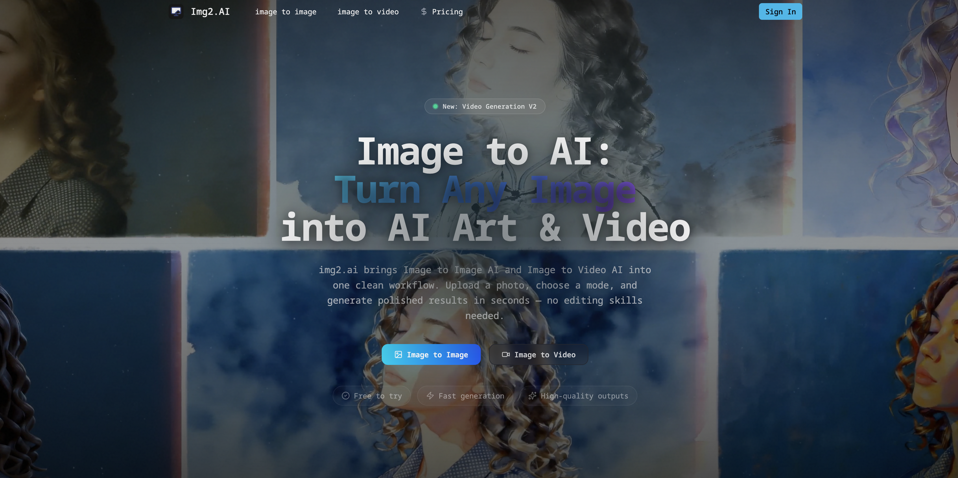
The screenshot above is the official preview served by the website itself. No generated replacement logo or mock screenshot is used here.
When to finish in a design editor
Even with stronger text rendering, there are cases where a conventional design tool remains the best final step. Long paragraphs, legal copy, exact brand typography, and accessibility-critical labels should usually be added as real text layers. AI generation is strongest for establishing the composition, visual mood, and major display text; deterministic tools are still better for pixel-perfect production typography.
The most productive approach is not to expect a single perfect prompt. Build the image in stages, keep the text brief, and treat editing as part of the workflow. That produces results that are both visually interesting and actually usable.
评论
发表评论